Bootstrap 3 grid system is the container or container fluid and row and column system, to make a mobile responsive website using bootstrap the grid system is the first need to make the structure and in this tutorial, we will learn how to make the structure of a website using the bootstrap grid system.
Bootstrap 3 Grid System
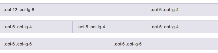
The bootstrap grid system is
the column will be inside the row and the row will be inside container or container fluid, so inside one container or container fluid there shall be multiple rows and inside the row, there shall be multiple columns up to 12 count column grid
*note there will not be a container or container fluid inside a container or container fluid and similarly inside a row, there should not be the row
What is the container?
the container is a media-wise fixed-width HTML element container and the width as
in minimum window width 1200 px the width of the container is 1170 px, and in case minimum window width 992px the width of the container will be 970px and in minimum window width 768px the width of the container will be 750px and below 768px media window width the width of the container will be 100%
Example:
<div class="container"></div>
What is container fluid?
and the container fluid is the HTML element container and its width is 100% in all media window width.
Example:
<div class="container-fluid"></div>
What is a row?
a row is a container of the horizontal group of the column and its width is 100% according to the container or container fluid
Example:
<div class="container-fluid">
	<div class="row"></div>
</div>
What is a column of bootstrap?
Content should be placed within columns, and only columns may be immediate children of rows and in case of bootstrap 3 the grid system is divided into 12 columns ie you can youse 12 col-md-1 or two col-md-6 or col-md-8 and col-md-4 in a row, etc.
Example:
<div class="container-fluid">
	<div class="row">
		<div class="col-md-12">column</div>
	</div>
</div>
Now there are several column types according to the media window width and its characteristics
and they are large media width column, medium media width column, small media width column, and extra small media width column,
large media width column
it is denoted by col-lg-1, col-lg-2 ….. up to col-lg-12 and the column discretion is worked above media width 1170px and below the media width the width of each col-lg-* becomes 100%
Example:
<div class="container-fluid">
	<div class="row">
		<div class="col-lg-8">column</div>
		<div class="col-lg-4">column</div>
	</div>
</div>
medium media width column
it is denoted by col-md-1, col-md-2 ….. up to col-md-12 and the column discretion is worked above media width 970px and below the media width the width of each col-md-* becomes 100% and it will work for greater media width column also if not selected column for that
Example:
<div class="container-fluid">
	<div class="row">
		<div class="col-md-8">column</div>
		<div class="col-md-4">column</div>
	</div>
</div>
small media width column
it is denoted by col-sm-1, col-sm-2 ….. up to col-sm-12 and the column discretion is worked above media width 768px and below the media width the width of each col-sm-* becomes 100% and it will work for greater media width column also if not selected column for that
Example:
<div class="container-fluid">
	<div class="row">
		<div class="col-sm-8">column</div>
		<div class="col-sm-4">column</div>
	</div>
</div>
extra small media width column
it is denoted by col-xs-1, col-xs-2, col-xs-3 ….. col-xs-12 its working for below 768px media width window and also work for above 768px media width id not given the class name as col-lg-* or col-md-* or col-sm-*.
Example:
<div class="container-fluid">
	<div class="row">
		<div class="col-xs-8">column</div>
		<div class="col-xs-4">column</div>
	</div>
</div>
Give a gap on the left side of the column the offset of bootstrap
like column system, there is 4 type of offset for 4 types of media width device and they are: large media width offset, medium media width offset, small media width offset and extra small media width offset,
Example:
<div class="col-xs-offset-4">column</div>
large media width offset
it is denoted by col-lg-offset-1, col-lg-offset-2 ….. up to col-lg-offset-12 and the column discretion is worked above media width 1170px and below the media width the width of each col-lg-offset-* becomes 0px
Example:
<div class="container-fluid">
	<div class="row">
		<div class="col-lg-9 col-lg-offset-3">column</div>
	</div>
</div>
medium media width offset
it is denoted by col-md-offset-1, col-md-offset-2 ….. up to col-md-offset-12 and the column discretion is worked above media width 970px and below the media width the width of each col-md-* becomes 100% and it will work for greater media width column also if not selected column for that
Example:
<div class="container-fluid">
	<div class="row">
		<div class="col-md-9 col-md-offset-3">column</div>
	</div>
</div>
small media width offset
it is denoted by col-sm-1, col-sm-2 ….. up to col-sm-12 and the column discretion is worked above media width 768px and below the media width the width of each col-sm-* becomes 100% and it will work for greater media width column also if not selected column for that
Example:
<div class="container-fluid">
	<div class="row">
		<div class="col-sm-9 col-sm-offset-3">column</div>
	</div>
</div>
extra small media width offset
it is denoted by col-xs-1, col-xs-2, col-xs-3 ….. col-xs-12 its working for below 768px media width window and also work for above 768px media width id not given the class name as col-lg-offset-* or col-md-offset-* or col-sm-offset-*.
Example:
<div class="container-fluid">
	<div class="row">
		<div class="col-xs-9 col-xs-offset-3">column</div>
	</div>
</div>
Nested Grid System of Bootstrap 3
The nested grid is a grid inside the grid, suppose if you need two columns with each has 6 column width and inside the column, you need a 12 column row then you have to take a row and inside the row take a column and inside that take column again.
Example:
<div class="container-fluid">
	<div class="row">
		<div class="col-xs-9">
			<div class="col-xs-6">
				column
			</div>
			<div class="col-xs-6">
				column
			</div>
		</div>
		<div class="col-xs-3">column</div>
	</div>
</div>
Please give your valuable comment to make the site better, Thanks for reading…