Bootstrap 3 Alert box is used to get the immediate attention of the end-users such as warning, error, confirmation or success messages. Here can be used as an optional close button to hide the box. the alert box is mainly 4 types and they are…
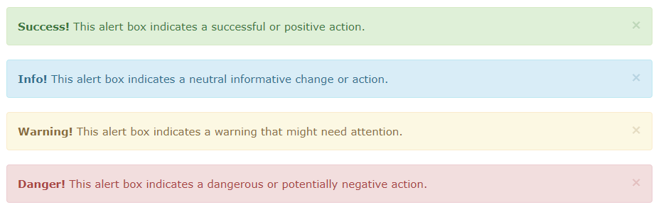
- 1. success or light green background with deep green text alert box,
- 2. info or light blue background with deep blue text alert box,
- 3. warning or light yellow background with deep yellow text alert box,
- 4. danger or light red background with deep red text alert box,
to use a close button give an anchor tag with class name .close and data-dismiss=” alert”
example:
<a href="#" class="close" data-dismiss="alert">×</a>
Bootstrap Alert Box
1. success or light green background with deep green text alert box
It indicates a successful or positive action and to use it use the class name .alert and .alert-success to make it animated you can use the class name .fade and .in also
example:
<div class="alert alert-success fade in">
    <a href="#" class="close" data-dismiss="alert">×</a>
    <strong>Success!</strong> Your message has been sent.
</div>
2. info or light blue background with deep blue text alert box
It indicates a neutral informative change or action and to use it use the class name .alert and .alert-info to make it animated you can use the class name .fade and .in also
example:
<div class="alert alert-info fade in">
    <a href="#" class="close" data-dismiss="alert">×</a>
    <strong>Note!</strong> Please read carefully.
</div>
3. warning or light yellow background with deep yellow text alert box
It indicates a warning that might need attention and to use it use the class name .alert and .alert-warning to make it animated you can use the class name .fade and .in also
example:
<div class="alert alert-warning fade in">
    <a href="#" class="close" data-dismiss="alert">×</a>
    <strong>Warning!</strong> There was a problem</a>.
</div>
4. danger or light red background with deep red text alert box
It indicates a dangerous or potentially negative action and to use it use the class name .alert and .alert-danger to make it animated you can use the class name .fade and .in also
example:
<div class="alert alert-danger fade in">
    <a href="#" class="close" data-dismiss="alert">×</a>
    <strong>Error!</strong> A problem occurred.
</div>
You have learned Bootstrap 3 Alert box and please provide your comment to make the site better and useful.
Thanks for reading